滤镜
filter
Utilities for applying filters to an element.
| Class | Styles |
|---|---|
filter-none | filter: none; |
filter-(<custom-property>) | filter: var(<custom-property>); |
filter-[<value>] | filter: <value>; |
Examples
Basic example
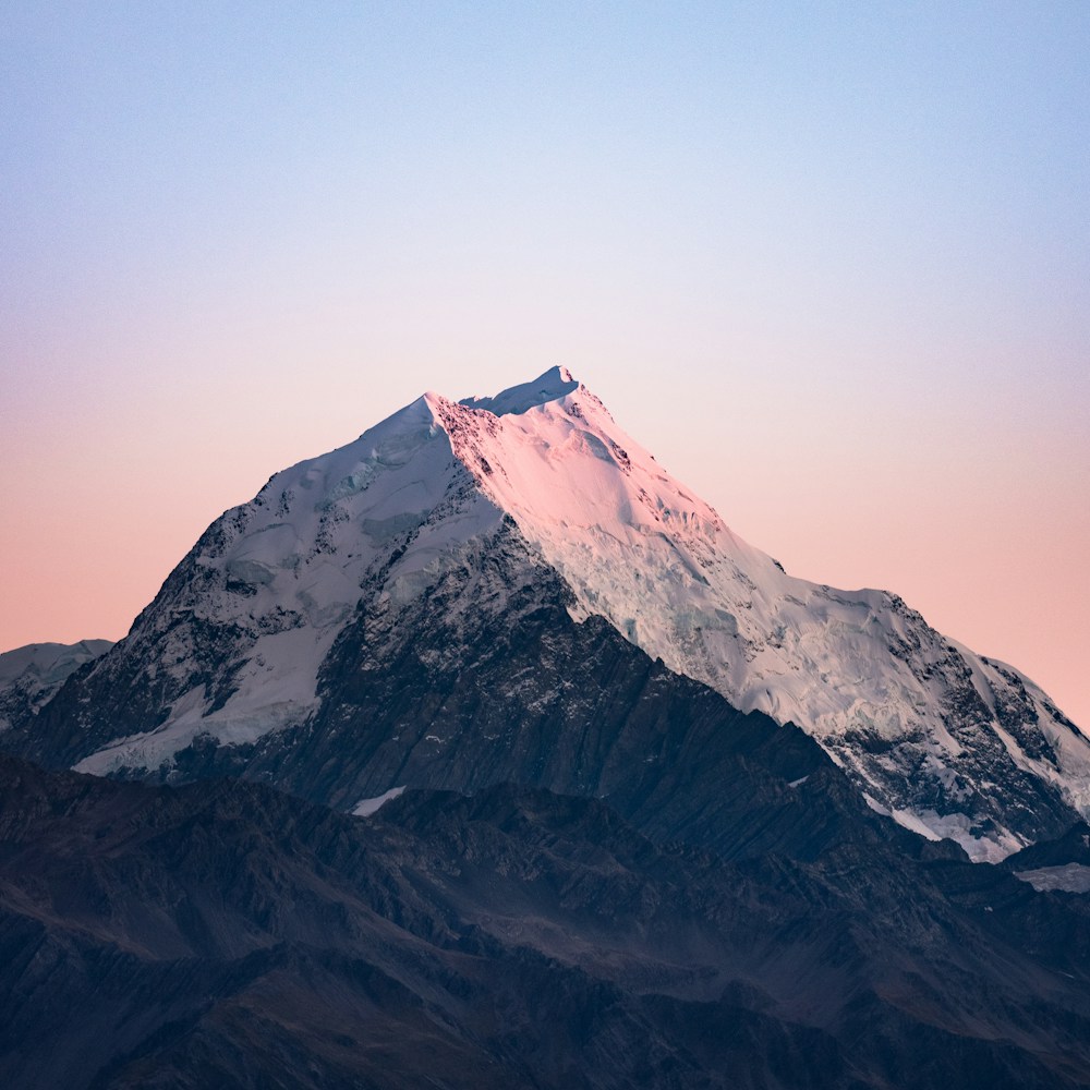
Use utilities like blur-xs and grayscale to apply filters to an element:
blur-xs
grayscale
combined
<img class="blur-xs" src="/img/mountains.jpg" /><img class="grayscale" src="/img/mountains.jpg" /><img class="blur-xs grayscale" src="/img/mountains.jpg" />You can combine the following filter utilities: blur, brightness, contrast, drop-shadow, grayscale, hue-rotate, invert, saturate, and sepia.
Removing filters
Use the filter-none utility to remove all of the filters applied to an element:
<img class="blur-md brightness-150 invert md:filter-none" src="/img/mountains.jpg" />Using a custom value
Use the filter-[<value>] syntax to set the filter based on a completely custom value:
<img class="filter-[url('filters.svg#filter-id')] ..." src="/img/mountains.jpg" />For CSS variables, you can also use the filter-(<custom-property>) syntax:
<img class="filter-(--my-filter) ..." src="/img/mountains.jpg" />This is just a shorthand for filter-[var(<custom-property>)] that adds the var() function for you automatically.
Applying on hover
Prefix a filter utility with a variant like hover:* to only apply the utility in that state:
<img class="blur-sm hover:filter-none ..." src="/img/mountains.jpg" />Learn more about using variants in the variants documentation.
Responsive design
Prefix a filter utility with a breakpoint variant like md: to only apply the utility at medium screen sizes and above:
<img class="blur-sm md:filter-none ..." src="/img/mountains.jpg" />Learn more about using variants in the variants documentation.