只需要HTML即可快速构建现代网站。
A utility-first CSS framework packed with classes like flex, pt-4, text-center and rotate-90 that can be 组合构建任何设计,直接在您的标记中。
<div class="flex flex-col items-center rounded-2xl"> <div> <img class="size-48 shadow-xl" alt="" src="/img/cover.png" /> </div> <div class="flex"> <span>Class Warfare</span> <span>The Anti-Patterns</span> <span class="flex"> <span>No. 4</span> <span>·</span> <span>2025</span> </span> </div></div>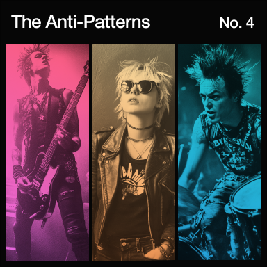
Why Tailwind CSS?
为现代网络而构建。
Tailwind 是现代的,并利用了所有最新的 CSS 功能,使开发体验尽可能愉快。
好吧,它不是最前沿的,但只需将屏幕大小放在任何实用程序的前面,即可在特定断点应用它。
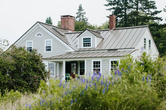

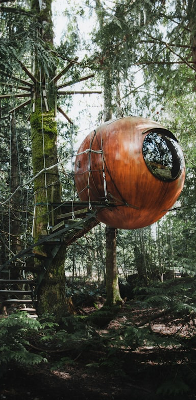
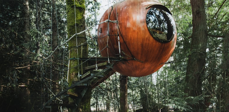
This sunny and spacious room is for those traveling light and looking for a comfy and cozy place to lay their head for a night... Show more
Show more

现在哪个网站没有几个背景模糊?继续堆叠滤镜,直到你的设计师让你停下来。
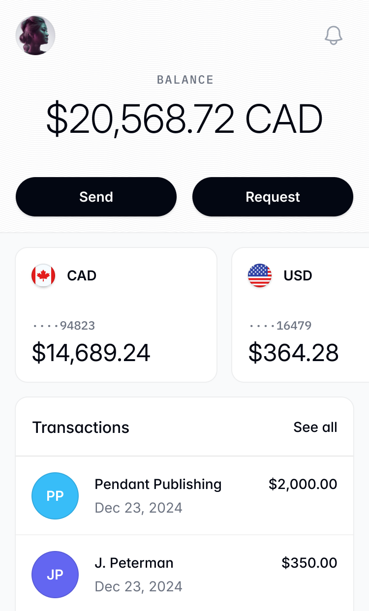
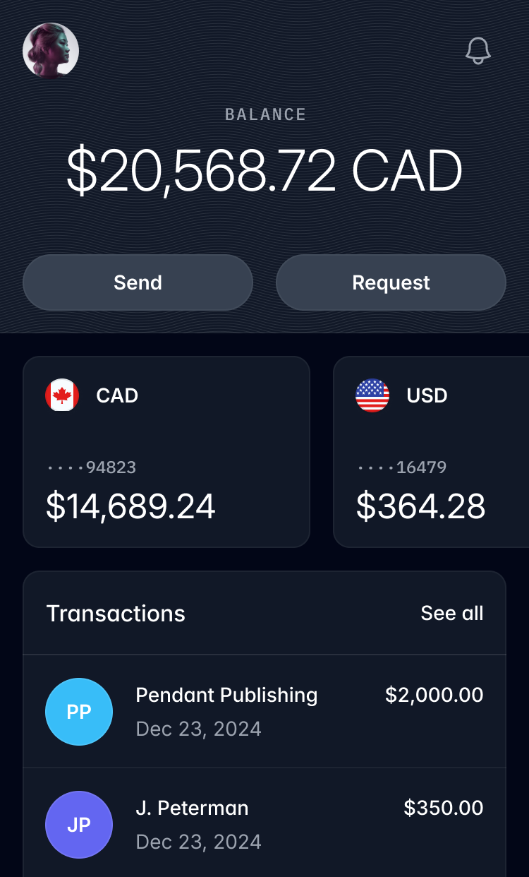
如果你不喜欢烧伤你的视网膜,只需在任何颜色前面添加 dark: 即可在夜间模式应用它。
自定义你的主题就像创建几个 CSS 变量一样简单。
@theme { --font-sans: "Inter", sans-serif; --font-mono: "IBM Plex Mono", monospace; --text-tiny: 0.625rem; --text-tiny--line-height: 1.5rem; --color-mint-100: oklch(0.97 0.15 145); --color-mint-200: oklch(0.92 0.18 145); --color-mint-300: oklch(0.85 0.22 145); --color-mint-400: oklch(0.78 0.25 145); --color-mint-500: oklch(0.7 0.28 145); --color-mint-600: oklch(0.63 0.3 145); --color-mint-700: oklch(0.56 0.32 145); --color-mint-800: oklch(0.48 0.35 145); --color-mint-900: oklch(0.4 0.37 145); --color-mint-950: oklch(0.3 0.4 145);}颜色调色板现在使用更鲜艳的宽色域颜色,而无需你理解任何这些意味着什么。
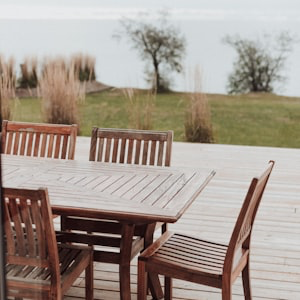
直接在您的 HTML 中使用网格实用程序,使推理复杂布局变得非常容易。
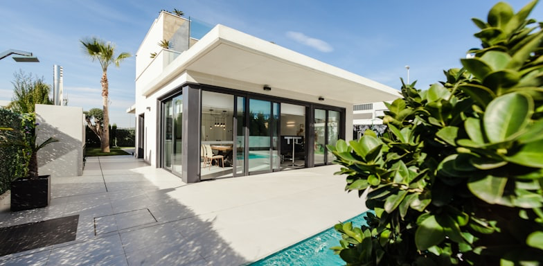
Browse properties


过渡工作方式如你所愿——在元素上添加几个实用程序,您就可以开始工作了。
transition duration-750linear
transition duration-750ease-out
transition duration-750ease-in-out
transition duration-750ease-in
Tailwind 使用 CSS 层,因此您不必担心特定性问题。
@layer theme, base, components, utilities;@layer theme { :root { /* Your theme variables */ }}@layer base { /* Preflight styles */}@layer components { /* Your custom components */}@layer utilities { /* Your utility classes */}支持多种语言文本方向不再是噩梦。
将元素标记为容器,让子元素适应其大小变化。
<div class="@container"> <div class="grid grid-cols-1 @sm:grid-cols-2"> <img src="/img/photo-1.jpg" class="aspect-square @sm:aspect-3/2 object-cover" /> <img src="/img/photo-2.jpg" class="aspect-square @sm:aspect-3/2 object-cover" /> <img src="/img/photo-3.jpg" class="aspect-square @sm:aspect-3/2 object-cover" /> <img src="/img/photo-4.jpg" class="aspect-square @sm:aspect-3/2 object-cover" /> </div></div>不需要记住复杂的渐变语法——只需使用几个实用类即可创建丝滑的渐变。
重新定义实时性能
我们的下一代渲染引擎提供无与伦比的速度和效率,让创作者以前所未有的方式突破界限。
有时两个维度还不够。缩放、旋转和翻译任何元素,以添加深度感。
工作原理
更快、更小。
Tailwind 在构建生产环境时会自动删除所有未使用的 CSS,这意味着您的最终 CSS 捆绑包可能是最小的。事实上,大多数 Tailwind 项目向客户端发送的 CSS 少于 10kB。
<!DOCTYPE html><html lang="en"> <head> <meta charset="UTF-8" /> <meta name="viewport" content="width=device-width, initial-scale=1.0" /> <title>Tailwind CSS</title> <link rel="stylesheet" href="/build.css" /> </head> <body> <button class=""></button> </body></html>@layer utilities {}Tailwind非常棒
构建你想要的任何东西,而无需触摸你的CSS文件。
因为 Tailwind 非常低级,所以它从不鼓励你设计相同的网站两次。你的许多最喜欢的网站都是用 Tailwind 构建的,你可能根本没有意识到。


现成组件
使用 Tailwind Plus 速度更快。
Tailwind Plus 是一个美丽的、完全响应的 UI 组件集合,由我们这些 Tailwind CSS 的创造者设计开发。它有数百个现成的示例可供选择,并保证帮助你找到构建所需的最佳起点。